I’ve always loved box/cover art. Whether it’s a game, a book or a movie, box art gives you a view into what you’re experience and triggers nostalgia when you return. Artists spends massive amounts of time planning, drafting and then creating that art, knowing that it can make the difference in whether or not something unfamiliar with the product will buy it.
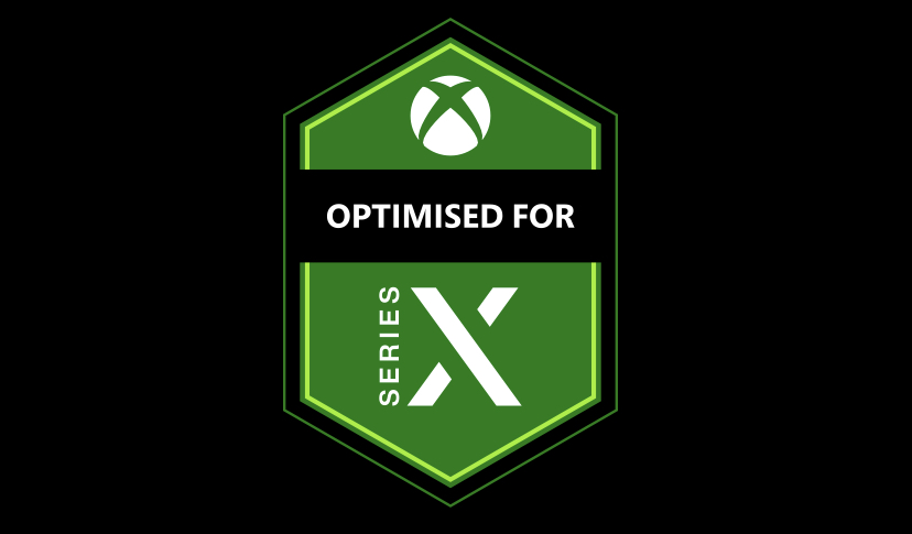
How many times have you walked into a store and bought a game/movie/book with no information other than the cover or the blurb on the back? It’s such an important part of physical media, so why is Xbox so intent on ruining it with their ‘Optimised for Series X’ badge?
Below are some examples of the Xbox One/Xbox Series X box art we’ve seen so far, all with a giant, hideous hexagon blocking a good chunk of it declaring ‘Optimised for Series X’. It’s clear that Xbox really, really want you to know the games will have special features on the Xbox Series X, but they already had standardised logos and icon spaces to help convey that information. Look in the top right hand corner, where a significantly more unobtrusive ‘Smart Delivery’ advisement lives. Why couldn’t they have done similarly unobtrusive to advise of Series X enhancements? The worst part is that they don’t even seem to have picked a single place to put the logo!
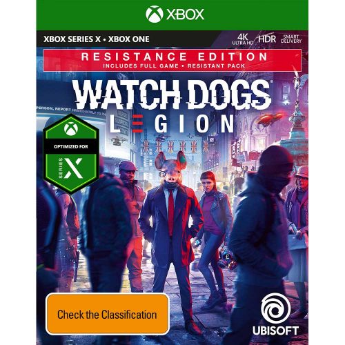
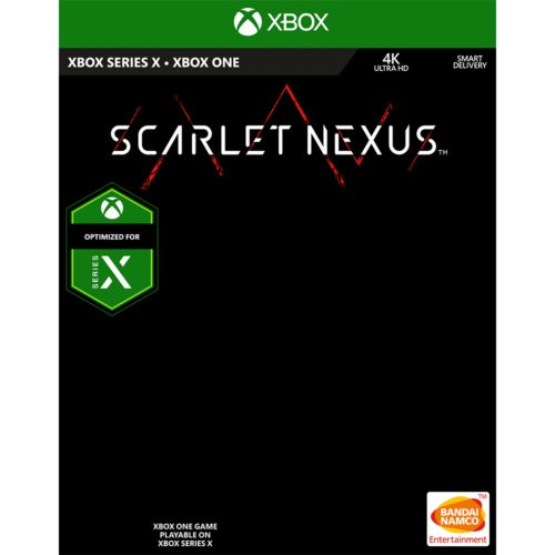
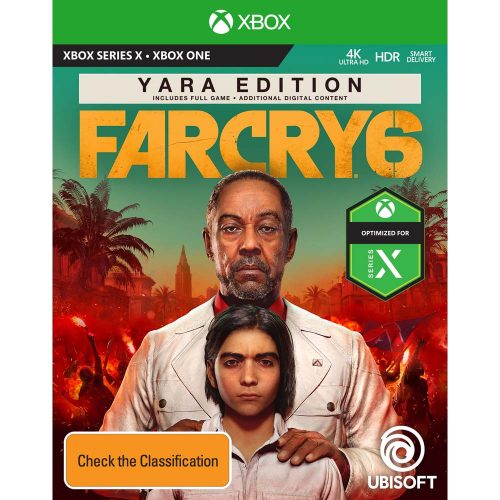
It’s not like we don’t already know the game will work on Series X, given the box literally has it in the top left hand corner, and they certainly didn’t do anything this obtrusive for games re-released and enhanced as part of the Backwards Compatibility program on Xbox One. Are these box arts meant to serve as additional advertising for the Series X maybe? Letting people know that the game they’re interested in is better on next-gen. Or are they making it front and center to put out the meaaagw that the game likely looks better on Series X rather than PlayStation 5?
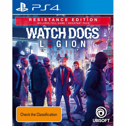
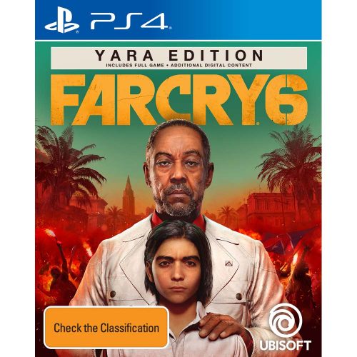
Compare all of these to the PlayStation 4 versions of the same games. The box art has more room to breath, instead of being cluttered by unnecessary badges and logos, with all additional information generally on the back of the box. There’s no lost details, like the people on the left of the Watch Dogs: Legion box art or the trees on the right of Far Cry 6’s art, completing the frame around Anton. The art has the space to do its intended purpose: help sell the game and not some vague enhancements that the game will have on a higher powered platform.
At the end of the day, I don’t really know why Xbox decided to run with this horrid hexagon of distraction to advise games are ‘Optomised for Series X’, but I don’t need to. All I really need to know is that it’s really messing with box art and I hate it.